


Table of contents

No headings in the article.
The choice of a styling approach to apply to projects has been a tough one for developers to make over the decades. Should the css styles be added in an inline manner or in an internal fashion? Oh, what about defining the styles in a separate file? Hmm, this sounds cool since we could differentiate our styles from our html and other logic implementations. However, we end up having the class attribute all over our entire codebase and it could even get messier for a bigger project. Well, if you are also concerned about these issues pointed out above, then this could be the perfect solution that you have been searching for.
Styled-components is a library designed for React and React Native developers. This package makes it both possible and easy to add styles directly to components. Sounds strange, right? Yes, we are injecting css styles into our JavaScript in a pattern often known as css-in-js. It makes it possible to have css attached to the html tags which we can then use like every other tag but with the added feature of being styled already!.
Adding these styled components to projects is quite straightforward as it follows the css patterns that we are already familiar with. In addition, some extra functionalities were added to the library to make this approach more dynamic and scalable.
First, let us create a ReactJs project with:
npx create-react-app my-app --template typescript
To include this styled-components in our created React project, we start by adding the package as a development dependency to our project. This is achieved by either running
npm install --save styled-components
or
yarn add styled-components
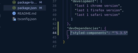
The newly added package can be seen under the devDepencies section in the package.json file as can be seen below.
Also add the type definition to enable typescript to undersatand the package:
npm install --save @types/styled-components
Inside the src folder, create a styles folder and add a file Globals.ts to it. This file contains the basic defaults as shown below:
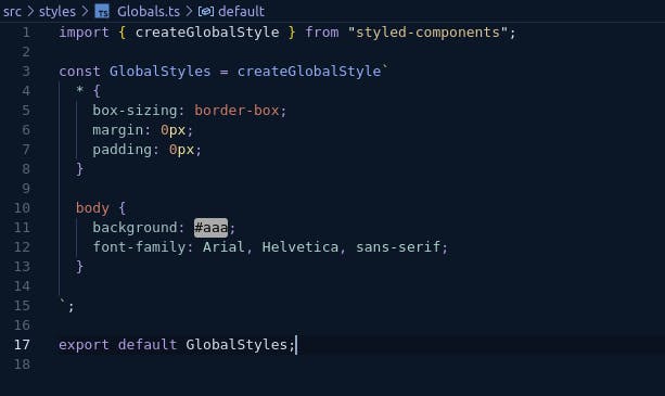
This Globals.ts is create with the createGlobalStyle that we imported from the styled-components package. The main purpose of this file is to enable us to set the default style rules that we often have in index.css file such as removing the default margins and paddings that come with the html tags.
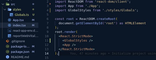
To apply the default rules that we have specified above to our entire app, we import the Globals.ts file into the index.tsx file and add it as a component:
Now, it's time to have some fun with styled-components.
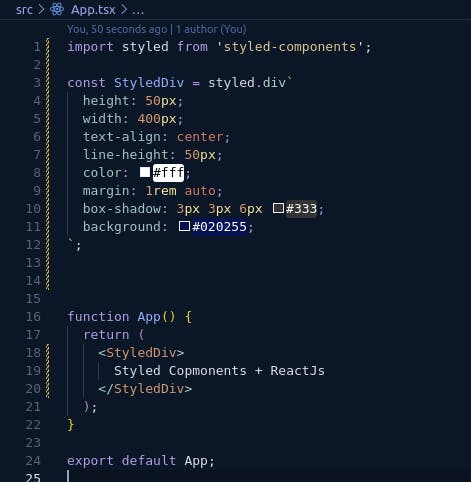
Inside App.tsx, let's create our first styled component by deleting the code that already exists inside and add our own script:
Running npm run start from the terminal, we have the result:

We have a div tag centered on the x-axis with blue background, a box shadow and its text centered both vertically and horizontally. We then use our created component which we gave the name StyledDiv as we would have used any html tag and we also do not have to use those annoying className attributes all over the place in our codebase.
It is also worth mentioning that we added Styled before the tag name (div) to make it easier to differentiate our styled components and the built-in html tag names. Also, we often create separate files and then create and export the styled components in those files. We can then import them and use them wherever we need them.
There are still more that styled-components can offer us like passing in props and dynamically changing our styles based on the received props, adding themes to have a single source of truth where all our common properties can be defined once and then refenced anywhere else in our code and a bunch more of interesting stuff to improve the experience for developers.
For more detailed explainations on this awesome library, you may check out their official documentation in the link styled-components official documentatiion